Correlation vs Causation: Why Smart Analysts Still Get It Wrong
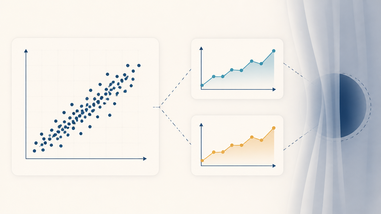
Correlation means two variables move together: when one changes, the other tends to change too. Causation means one variable actually produces the change in the other. Two things can be strongly correlated with no causal link between them, because a third factor drives both, because the cause runs the other way, or because of how the data was collected.
Everyone has heard "correlation isn't causation". Analysts still get it wrong regularly, because the mistakes rarely look like the textbook example of ice cream and drowning. They look like a reasonable dashboard insight that gets presented to management. This article covers the four traps that cause most of these errors, with a business example for each.
First, What Correlation Actually Measures
The correlation coefficient (usually Pearson's r) runs from −1 to +1:
+1: a perfect positive linear relationship (one goes up, the other goes up)
0: no linear relationship
−1: a perfect negative linear relationship
Two points trip people up. First, r only measures linear relationships, so a strong curved pattern can give r close to 0. Second, even r = 0.9 tells you nothing about why the variables move together. Always plot the data before trusting a single number.
Trap 1: The Confounder (a Hidden Third Variable)
The classic example: ice cream sales and drowning deaths are correlated. Ice cream doesn't cause drowning. Hot weather drives both.
The business version: an analyst finds that stores with more staff have higher sales, and recommends hiring. But bigger stores in busier locations get both more staff and more customers. Store size and foot traffic are the confounders. Adding staff to a quiet small-town store won't bring in more customers.
How to catch it: before recommending action, ask "what else could drive both of these?" Then compare like with like, for example stores of similar size and location, or control for the suspected confounder in a regression.
Trap 2: Reverse Causality
Sometimes the relationship is real, but the cause runs the other way.
The business version: customers who contact support more often churn more, so the proposal is to make support harder to reach. In reality, customers who are already unhappy contact support more. Dissatisfaction causes both the calls and the churn. Cutting support would probably make churn worse.
How to catch it: check the timing. Which came first? If you can't establish that the supposed cause happened before the effect, you can't claim causation.
Trap 3: Selection Bias
This trap comes from who ends up in your data.
The business version: customers who installed the loyalty app have a 48% repeat-purchase rate, against 24% for those who didn't. The marketing team claims the app doubles repeat purchases.
But the people who bothered to install a loyalty app were already the most loyal customers. They selected themselves into the group. To measure the app's real effect, the company ran a proper test: it randomly invited half of a group of similar customers to install the app and held the other half back. The invited group's repeat rate rose from 24% to 27%. That's a real effect of 3 percentage points, about a tenth of the 24-point gap on the dashboard.
How to catch it: whenever the "treated" group chose to be treated, assume the groups differed before the treatment.
Trap 4: Simpson's Paradox
This is the least intuitive trap: a pattern that appears in every subgroup reverses when you combine the groups.
A retailer tested a discount coupon. The overall numbers:
Customers
Converted
Rate
Got discount
1,000
160
16.0%
No discount
1,200
266
22.2%
The conclusion looks obvious: discounts hurt conversion. Now split by channel:
Channel
Discount
No discount
Online
90 / 300 = 30%
250 / 1,000 = 25%
In-store
70 / 700 = 10%
16 / 200 = 8%
The discount wins in both channels. The overall result flipped because most discounts went to in-store customers, who convert at a much lower rate whatever you do. The mix of customers drove the overall number, not the coupon.
How to catch it: when groups are different sizes and have different baseline rates, always break results down by the main segments before drawing a conclusion.
Bonus Trap: Pure Coincidence
Look at enough metrics and some will correlate by chance. A dashboard with 50 KPIs has 1,225 possible pairs, so several strong-looking correlations are almost guaranteed even in random data. Be most skeptical of a relationship that has no plausible mechanism and was found by scanning many metrics, not by testing a hypothesis you had in advance.
How to Actually Establish Causation
Method
How it works
When to use it
Randomized experiment (A/B test)
Randomly assign the treatment, so the groups differ only by the treatment
Whenever you can control who gets the change. This is the gold standard
Natural experiment
Find an event that split people almost randomly (a rollout by region, a policy cut-off date)
When a randomized test isn't possible
Difference-in-differences
Compare how the treated and untreated groups changed over the same period
Rollouts that happen in some places and not others
Regression with controls
Statistically hold confounders constant
When you know and can measure the main confounders
If none of these is possible, say so honestly. Present the finding as "associated with" rather than "causes", and list the alternative explanations you couldn't rule out.
The Language Check Before You Present
The words you choose matter. A quick check for any slide or report:
Correlational data → "is associated with", "customers who X tend to Y", "linked to"
Separating correlation from causation is the core skill of diagnostic analytics, the "why did it happen?" step in the four types of data analytics. It's also what separates analysts who get trusted with decisions from those who only produce reports. It's a common interview topic as well: expect a question like "our app users spend more; should we push everyone to the app?"
Can correlation ever prove causation?
Not on its own. A strong, consistent correlation with a plausible mechanism, the right timing and no obvious confounders is evidence, but proof needs an experiment or a credible quasi-experimental design.
What is a good example of correlation without causation?
Ice cream sales and drownings (both driven by hot weather) is the classic. A business example is stores with more staff having higher sales, because both are driven by store size and foot traffic.
Does machine learning find causation?
Standard predictive models find correlations that help predict outcomes. They don't identify causes. A churn model can accurately flag customers who contact support often without that meaning support calls cause churn. Causal inference is a separate set of methods.
How is an A/B test different from comparing users and non-users?
In an A/B test, you decide at random who gets the change, so the groups are equivalent beforehand. When you compare users with non-users, the users chose themselves, so the groups were already different, which is selection bias.
Bottom Line
Correlation shows that two things move together. Causation shows that one drives the other. Confounders, reverse causality, selection bias and Simpson's paradox create convincing correlations with no causal link behind them. Randomized experiments are the most reliable test. When you can't run one, choose your words carefully.