Path Overview
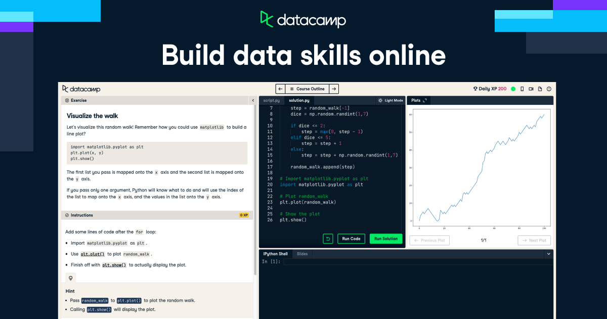
This DataCamp track bundles four courses and a hands-on project around one goal: getting you comfortable building charts and visual stories out of messy data using Python. Rather than teaching one library in depth, it walks you across the ecosystem — starting with the fundamentals in Matplotlib, moving into the more polished aesthetics of Seaborn, then layering on techniques for improving chart clarity, and finishing with geospatial mapping using geopandas and folium. The sequencing is sensible: each course assumes you've picked up the previous one's basics, so by the end you're not just plotting lines and bars but handling categorical, aggregated, and location-based data too.
What's Included in This Path
- Introduction to Data Visualization with Matplotlib
- Introduction to Data Visualization with Seaborn
- Improving Your Data Visualizations in Python
- Visualizing Geospatial Data in Python
- Bonus project: Compare Baseball Player Statistics using Visualizations (using MLB Statcast data to compare Aaron Judge and Giancarlo Stanton)
Skills You Will Build
- Building and customizing static plots in Matplotlib (titles, labels, subplots, styling)
- Creating statistically-informed visuals in Seaborn with less boilerplate code
- Choosing the right chart type and refining visuals so they communicate findings clearly instead of just looking busy
- Mapping geospatial data with geopandas and rendering interactive maps with folium
- Applying everything to a real dataset in the bonus baseball-stats project, which is a nice gut-check on whether the skills actually stuck
Who Is This Path For?
This track fits people who already know basic Python syntax — variables, loops, data structures — but have never really plotted anything beyond a quick print() statement. Data analysts, students, bioinformaticians, or anyone whose job involves explaining numbers to non-technical stakeholders will find it directly useful. If you're already comfortable with Matplotlib and Seaborn and want advanced dashboarding or production-grade visualization (think Plotly Dash, Streamlit, or D3), this track will feel too introductory and you should look further down DataCamp's catalog or elsewhere.
Time Commitment & Certificate
DataCamp lists the whole track at 16 hours, which is realistic if you're doing the in-browser exercises at a steady clip rather than rewatching every video. It's self-paced with no deadlines, so you can stretch it over a weekend or a month without penalty. Finishing earns a Statement of Accomplishment you can post to LinkedIn — useful as a signal of initiative, though it's not an industry-recognized certification in the way a university credential or a well-known professional certificate would be.
Pros and Cons
Pros
- Covers four distinct libraries/tools in one coherent sequence instead of forcing you to piece together separate courses
- Includes a genuine applied project with real sports data, not just toy datasets
- No prerequisites beyond basic Python, so it's a low-barrier entry point
- Self-paced structure with browser-based coding, no setup required
Cons
- 16 hours across five libraries means each tool gets fairly shallow treatment — don't expect to come out an expert in any single one
- The Statement of Accomplishment carries little weight with employers compared to recognized certifications (e.g., university credentials or vendor-specific certs)
- Requires an active DataCamp subscription to access, so the real cost is tied to their pricing plans rather than a one-time track fee
- If you already know Matplotlib or Seaborn individually, a chunk of this track will be redundant for you
FAQ
Do I need any visualization experience before starting?
No. The track only assumes basic Python knowledge — it introduces each visualization library from the ground up.
How much does this track cost?
Pricing isn't bundled into the track itself; you'll need a DataCamp subscription to access it, with business and university plans available separately.
Is the certificate worth putting on my resume?
It's reasonable to list as evidence of upskilling, but treat it as a supplement to a portfolio or project work rather than a credential that alone opens doors.
How does this compare to just learning Matplotlib or Seaborn individually?
If you only need one library for a specific project, taking that single course is faster and cheaper. This track makes more sense if you want breadth across static, statistical, and geospatial visualization in one go.
Curious whether this fits your current skill gap? Take a look at the official DataCamp track page for the full course breakdown before committing.